← return to practice.dsc10.com
Welcome! The problems shown below should be worked on on
paper, since the quizzes and exams you take in this course will
also be on paper. You do not need to submit your solutions anywhere.
We encourage you to complete this worksheet in groups during an
extra practice session on Friday, January 26. Solutions will be posted
after all sessions have finished. This problem set is not designed to
take any particular amount of time - focus on understanding concepts,
not on getting through all the questions.
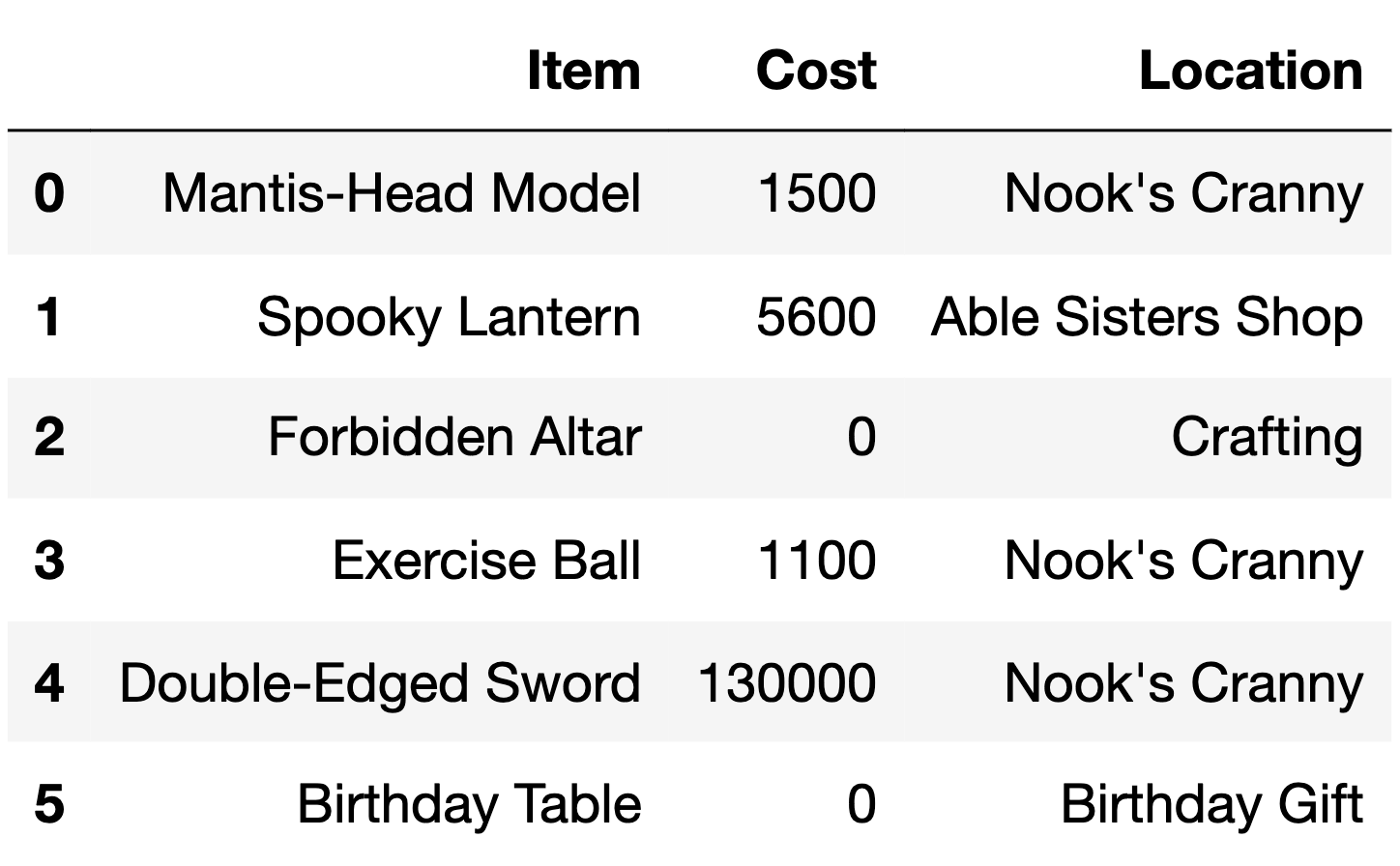
The DataFrame items describes various items available to
collect or purchase using bells, the currency used in the game
Animal Crossing: New Horizons.
For each item, we have:
"Item" (str): The name of the item."Cost" (int): The cost of the item in bells. Items that
cost 0 bells cannot be purchased and must be collected through other
means (such as crafting)."Location" (str): The store or action through which the
item can be obtained.The first 6 rows of items are below, though
items has more rows than are shown here.
Which type of plot should we use to visualize the distribution of the
"Location" column in the items DataFrame?
Scatter plot
Line plot
Bar chart
Histogram
Answer: Bar chart
The average score on this problem was 74%.
Nintendo collected data on the heights of a sample of Animal Crossing: New Horizons players. A histogram of the heights in their sample is given below.
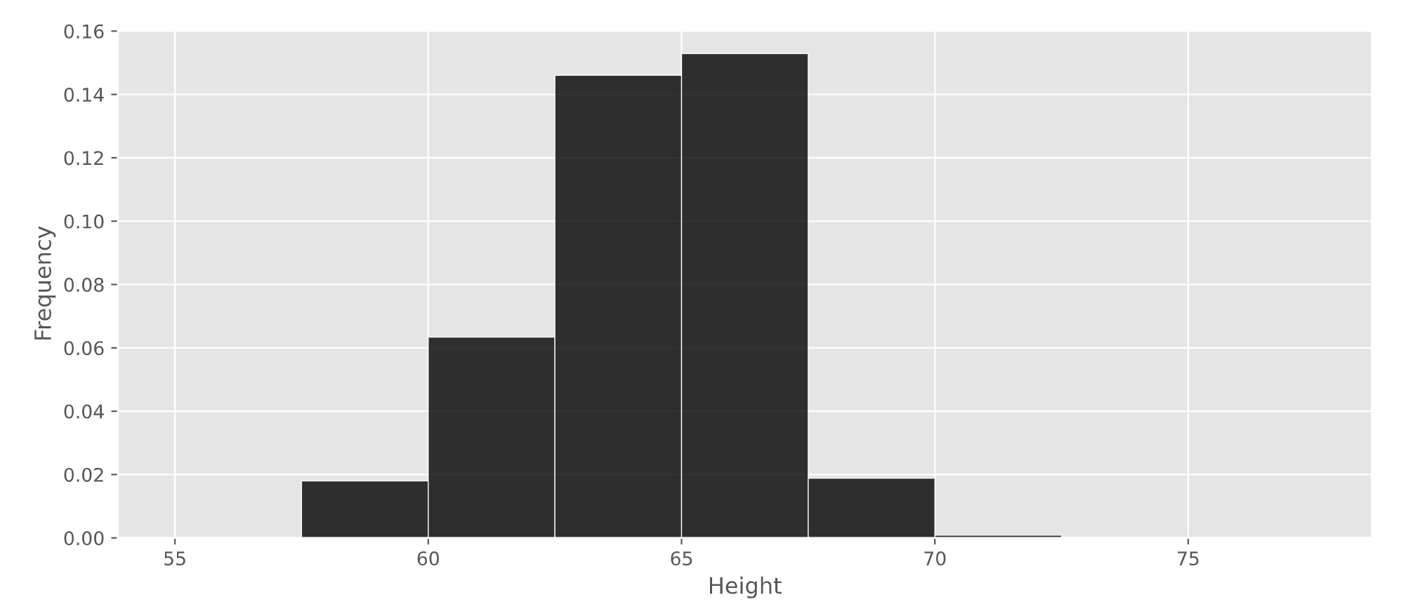
What percentage of players in Nintendo’s sample are at least 62.5 inches tall? Give your answer as an integer rounded to the nearest multiple of 5.
Answer: 80%
The average score on this problem was 73%.
You are given a DataFrame called restaurants that
contains information on a variety of local restaurants’ daily number of
customers and daily income. There is a row for each restaurant for each
date in a given five-year time period.
The columns of restaurants are 'name'
(string), 'year' (int), 'month' (int),
'day' (int), 'num_diners' (int), and
'income' (float).
Assume that in our data set, there are not two different restaurants
that go by the same 'name' (chain restaurants, for
example).
What type of visualization would be best to display the data in a way that helps to answer the question “Do more customers bring in more income?”
scatterplot
line plot
bar chart
histogram
Answer: scatterplot
The number of customers is given by 'num_diners' which
is an integer, and 'income' is a float. Since both are
numerical variables, neither of which represents time, it is most
appropriate to use a scatterplot.
The average score on this problem was 87%.
What type of visualization would be best to display the data in a way that helps to answer the question “Have restaurants’ daily incomes been declining over time?”
scatterplot
line plot
bar chart
histogram
Answer: line plot
Since we want to plot a trend of a numerical quantity
('income') over time, it is best to use a line plot.
The average score on this problem was 95%.
Welcome to Sun God!

In this problem, we’ll be looking at a DataFrame named
sungod that contains information on the artists who have
performed at Sun God, UCSD’s annual music festival, in years past. The
columns are:
'Year' (int): the year of the
festival'Artist' (str): the name of the
artist'Appearance_Order' (int): the order in
which the artist appeared in that year’s festival (1 means they came
onstage first)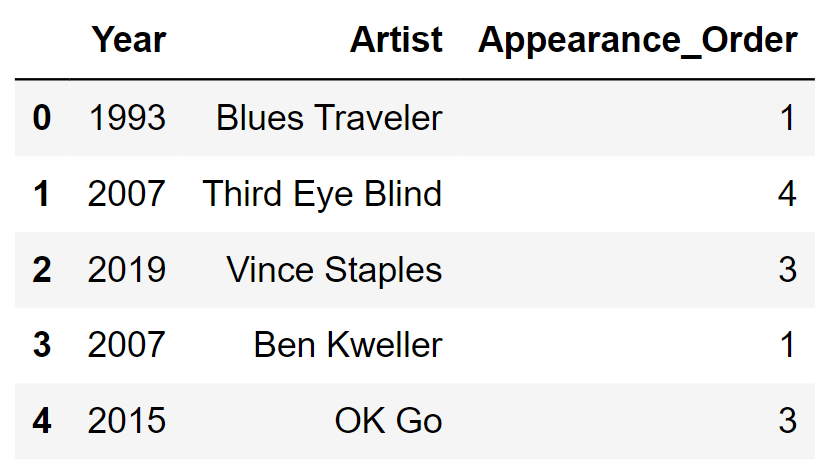
Assume we have already run import babypandas as bpd and
import numpy as np.
On the graph paper below, draw the histogram that would be produced by this code.
(
sungod.take(np.arange(5))
      .plot(kind='hist', density=True,
      bins=np.arange(0, 7, 2), y='Appearance_Order');
)
In your drawing, make sure to label the height of each bar in the histogram on the vertical axis. You can scale the axes however you like, and the two axes don’t need to be on the same scale.
Answer:
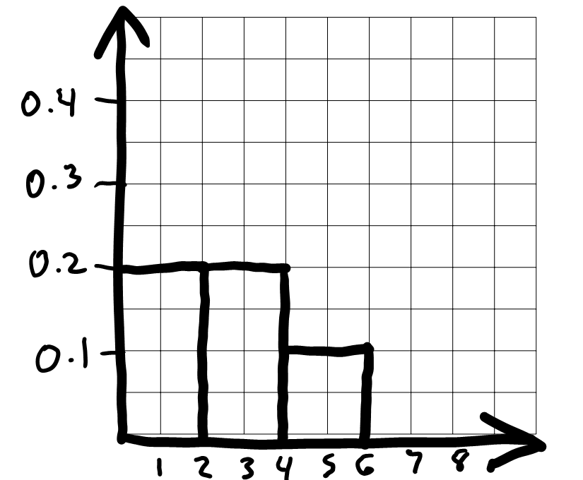
To draw the histogram, we first need to bin the data and figure out
how many data values fall into each bin. The code includes
bins=np.arange(0, 7, 2) which means the bin endpoints are
0, 2, 4, 6. This gives us three bins:
[0, 2), [2,
4), and [4, 6]. Remember that
all bins, except for the last one, include the left endpoint but not the
right. The last bin includes both endpoints.
Now that we know what the bins are, we can count up the number of
values in each bin. We need to look at the
'Appearance_Order' column of
sungod.take(np.arange(5)), or the first five rows of
sungod. The values there are 1,
4, 3, 1, 3. The two 1s fall into
the first bin [0, 2). The two 3s fall into the second bin [2, 4), and the one 4 falls into the last bin [4, 6]. This means the proportion of values
in each bin are \frac{2}{5}, \frac{2}{5},
\frac{1}{5} from left to right.
To figure out the height of each bar in the histogram, we use the fact that the area of a bar in a density histogram should equal the proportion of values in that bin. The area of a rectangle is height times width, so height is area divided by width.
For the bin [0, 2), the area is \frac{2}{5} = 0.4 and the width is 2, so the height is \frac{0.4}{2} = 0.2.
For the bin [2, 4), the area is \frac{2}{5} = 0.4 and the width is 2, so the height is \frac{0.4}{2} = 0.2.
For the bin [4, 6], the area is \frac{1}{5} = 0.2 and the width is 2, so the height is \frac{0.2}{2} = 0.1.
Since the bins are all the same width, the fact that there an equal number of values in the first two bins and half as many in the third bin means the first two bars should be equally tall and the third should be half as tall. We can use this to draw the rest of the histogram quickly once we’ve drawn the first bar.
The average score on this problem was 45%.
You have a DataFrame called prices that contains
information about food prices at 18 different grocery stores. There is
column called 'broccoli' that contains the price in dollars
for one pound of broccoli at each grocery store. There is also a column
called 'ice_cream' that contains the price in dollars for a
pint of store-brand ice cream.
Using the code,
prices.plot(kind='hist', y='broccoli', bins=np.arange(0.8, 2.11, 0.1), density=True)we produced the histogram below:
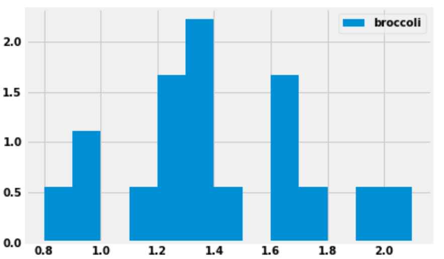
How many grocery stores sold broccoli for a price greater than or equal to $1.30 per pound, but less than $1.40 per pound (the tallest bar)?
Answer: 4 grocery stores
We are given that the bins start at 0.8 and have a width of 0.1, which means one of the bins has endpoints 1.3 and 1.4. This bin (the tallest bar) includes all grocery stores that sold broccoli for a price greater than or equal to $1.30 per pound, but less than $1.40 per pound.
This bar has a width of 0.1 and we’d estimate the height to be around 2.2, though we can’t say exactly. Multiplying these values, the area of the bar is about 0.22, which means about 22 percent of the grocery stores fall into this bin. There are 18 grocery stores in total, as we are told in the introduction to this question. We can compute using a calculator that 22 percent of 18 is 3.96. Since the actual number of grocery stores this represents must be a whole number, this bin must represent 4 grocery stores.
The reason for the slight discrepancy between 3.96 and 4 is that we used 2.2 for the height of the bar, a number that we determined by eye. We don’t know the exact height of the bar. It is reassuring to do the calculation and get a value that’s very close to an integer, since we know the final answer must be an integer.
The average score on this problem was 71%.
Suppose we now plot the same data with different bins, using the following line of code:
prices.plot(kind='hist', y='broccoli', bins=[0.8, 1, 1.1, 1.5, 1.8, 1.9, 2.5], density=True)What would be the height on the y-axis for the bin corresponding to the interval [\$1.10, \$1.50)? Input your answer below.
Answer: 1.25
First, we need to figure out how many grocery stores the bin [\$1.10, \$1.50) contains. We already know from the previous subpart that there are four grocery stores in the bin [\$1.30, \$1.40). We could do similar calculations to find the number of grocery stores in each of these bins:
However, it’s much simpler and faster to use the fact that when the bins are all equally wide, the height of a bar is proportional to the number of data values it contains. So looking at the histogram in the previous subpart, since we know the [\$1.30, \$1.40) bin contains 4 grocery stores, then the [\$1.10, \$1.20) bin must contain 1 grocery store, since it’s only a quarter as tall. Again, we’re taking advantage of the fact that there must be an integer number of grocery stores in each bin when we say it’s 1/4 as tall. Our only options are 1/4, 1/2, or 3/4 as tall, and among those choices, it’s clear.
Therefore, by looking at the relative heights of the bars, we can quickly determine the number of grocery stores in each bin:
Adding these numbers together, this means there are 9 grocery stores whose broccoli prices fall in the interval [\$1.10, \$1.50). In the new histogram, these 9 grocery stores will be represented by a bar of width 1.50-1.10 = 0.4. The area of the bar should be \frac{9}{18} = 0.5. Therefore the height must be \frac{0.5}{0.4} = 1.25.
The average score on this problem was 33%.
You are interested in finding out the number of stores in which a pint of ice cream was cheaper than a pound of broccoli. Will you be able to determine the answer to this question by looking at the plot produced by the code below?
prices.get(['broccoli', 'ice_cream']).plot(kind='barh')Yes
No
Answer: Yes
When we use .plot without specifying a y
column, it uses every column in the DataFrame as a y column
and creates an overlaid plot. Since we first use get with
the list ['broccoli', 'ice_cream'], this keeps the
'broccoli' and 'ice_cream' columns from
prices, so our bar chart will overlay broccoli prices with
ice cream prices. Notice that this get is unnecessary
because prices only has these two columns, so it would have
been the same to just use prices directly. The resulting
bar chart will look something like this:
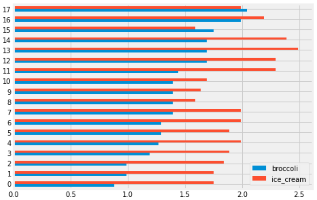
Each grocery store has its broccoli price represented by the length of the blue bar and its ice cream price represented by the length of the red bar. We can therefore answer the question by simply counting the number of red bars that are shorter than their corresponding blue bars.
The average score on this problem was 78%.
You are interested in finding out the number of stores in which a pint of ice cream was cheaper than a pound of broccoli. Will you be able to determine the answer to this question by looking at the plot produced by the code below?
prices.get(['broccoli', 'ice_cream']).plot(kind='hist')Yes
No
Answer: No
This will create an overlaid histogram of broccoli prices and ice cream prices. So we will be able to see the distribution of broccoli prices together with the distribution of ice cream prices, but we won’t be able to pair up particular broccoli prices with ice cream prices at the same store. This means we won’t be able to answer the question. The overlaid histogram would look something like this:
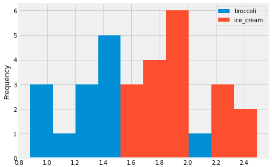
This tells us that broadly, ice cream tends to be more expensive than broccoli, but we can’t say anything about the number of stores where ice cream is cheaper than broccoli.
The average score on this problem was 81%.
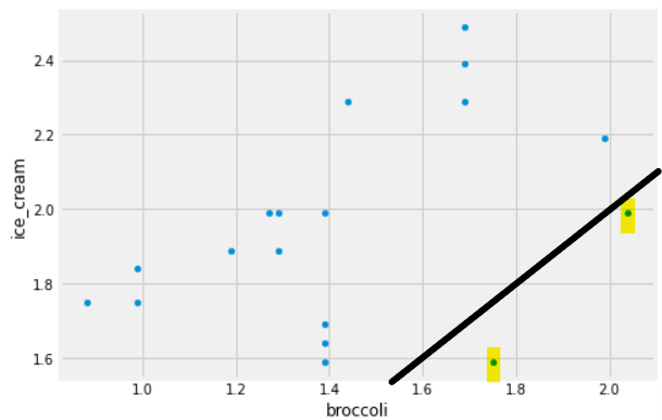
Some code and the scatterplot that produced it is shown below:
(prices.get(['broccoli', 'ice_cream']).plot(kind='scatter', x='broccoli', y='ice_cream'))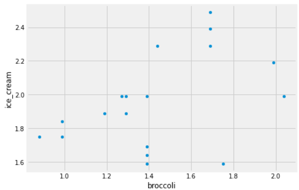
Can you use this plot to figure out the number of stores in which a pint of ice cream was cheaper than a pound of broccoli?
If so, say how many such stores there are and explain how you came to that conclusion.
If not, explain why this scatterplot cannot be used to answer the question.
Answer: Yes, and there are 2 such stores.
In this scatterplot, each grocery store is represented as one dot. The x-coordinate of that dot tells the price of broccoli at that store, and the y-coordinate tells the price of ice cream. If a grocery store’s ice cream price is cheaper than its broccoli price, the dot in the scatterplot will have y<x. To identify such dots in the scatterplot, imagine drawing the line y=x. Any dot below this line corresponds to a point with y<x, which is a grocery store where ice cream is cheaper than broccoli. As we can see, there are two such stores.
The average score on this problem was 78%.
The seat-back TV on one of King Triton’s more recent flights was very
dirty and was full of fingerprints. The fingerprints made an interesting
pattern. We’ve stored the x and y positions of each fingerprint in the
DataFrame fingerprints, and created the following
scatterplot using
fingerprints.plot(kind='scatter', x='x', y='y')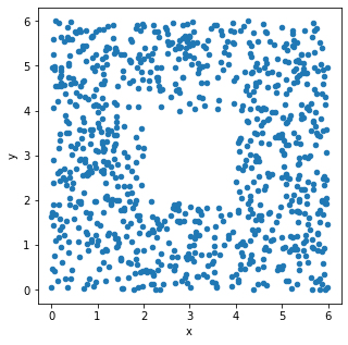
True or False: The histograms that result from the following two lines of code will look very similar.
fingerprints.plot(kind='hist',
                  y='x',
                  density=True,
                  bins=np.arange(0, 8, 2))
and
fingerprints.plot(kind='hist',
                  y='y',
                  density=True,
                  bins=np.arange(0, 8, 2))
True
False
Answer: True
The only difference between the two code snippets is the data values
used. The first creates a histogram of the x-values in
fingerprints, and the second creates a histogram of the
y-values in fingerprints.
Both histograms use the same bins:
bins=np.arange(0, 8, 2). This means the bin endpoints are
[0, 2, 4, 6], so there are three distinct bins: [0, 2), [2,
4), and [4, 6]. Remember the
right-most bin of a histogram includes both endpoints, whereas others
include the left endpoint only.
Let’s look at the x-values first. If we divide the
scatterplot into nine equally-sized regions, as shown below, note that
eight of the nine regions have a very similar number of data points.
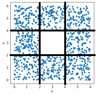
Aside from the middle region, about \frac{1}{8} of the data falls in each region.
That means \frac{3}{8} of the data has
an x-value in the first bin [0,
2), \frac{2}{8} of the data has
an x-value in the middle bin [2,
4), and \frac{3}{8} of the data
has an x-value in the rightmost bin [4, 6]. This distribution of
x-values into bins determines what the histogram will look
like.
Now, if we look at the y-values, we’ll find that \frac{3}{8} of the data has a
y-value in the first bin [0,
2), \frac{2}{8} of the data has
a y-value in the middle bin [2,
4), and \frac{3}{8} of the data
has a y-value in the last bin [4,
6]. That’s the same distribution of data into bins as the
x-values had, so the histogram of y-values
will look just like the histogram of x-values.
Alternatively, an easy way to see this is to use the fact that the
scatterplot is symmetric over the line y=x, the line that makes a 45 degree angle
with the origin. In other words, interchanging the x and
y values doesn’t change the scatterplot noticeably, so the
x and y values have very similar
distributions, and their histograms will be very similar as a
result.
The average score on this problem was 88%.
Below, we’ve drawn a histogram using the line of code
fingerprints.plot(kind='hist',
                  y='x',
                  density=True,
                  bins=np.arange(0, 8, 2))
However, our Jupyter Notebook was corrupted, and so the resulting histogram doesn’t quite look right. While the height of the first bar is correct, the histogram doesn’t contain the second or third bars, and the y-axis is replaced with letters.
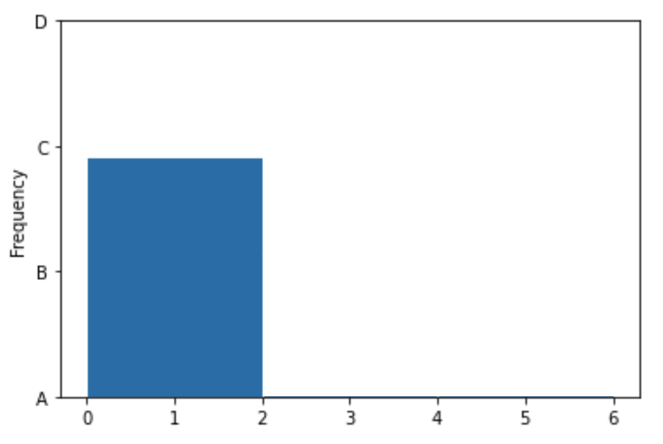
Which of the four options on the y-axis is closest to where the height of the middle bar should be?
A
B
C
D
Which of the four options on the y-axis is closest to where the height of the rightmost bar should be?
A
B
C
D
Answer: B, then C
We’ve already determined that the first bin should contain \frac{3}{8} of the values, the middle bin should contain \frac{2}{8} of the values, and the rightmost bin should contain \frac{3}{8} of the values. The middle bar of the histogram should therefore be two-thirds as tall as the first bin, and the rightmost bin should be equally as tall as the first bin. The only reasonable height for the middle bin is B, as it’s closest to two-thirds of the height of the first bar. Similarly, the rightmost bar must be at height C, as it’s the only one close to the height of the first bar.
The average score on this problem was 94%.
Suppose there are 200 students enrolled in DSC 10, and that the histogram below displays the distribution of the number of Instagram followers each student has, measured in 100s. That is, if a student is represented in the first bin, they have between 0 and 200 Instagram followers.
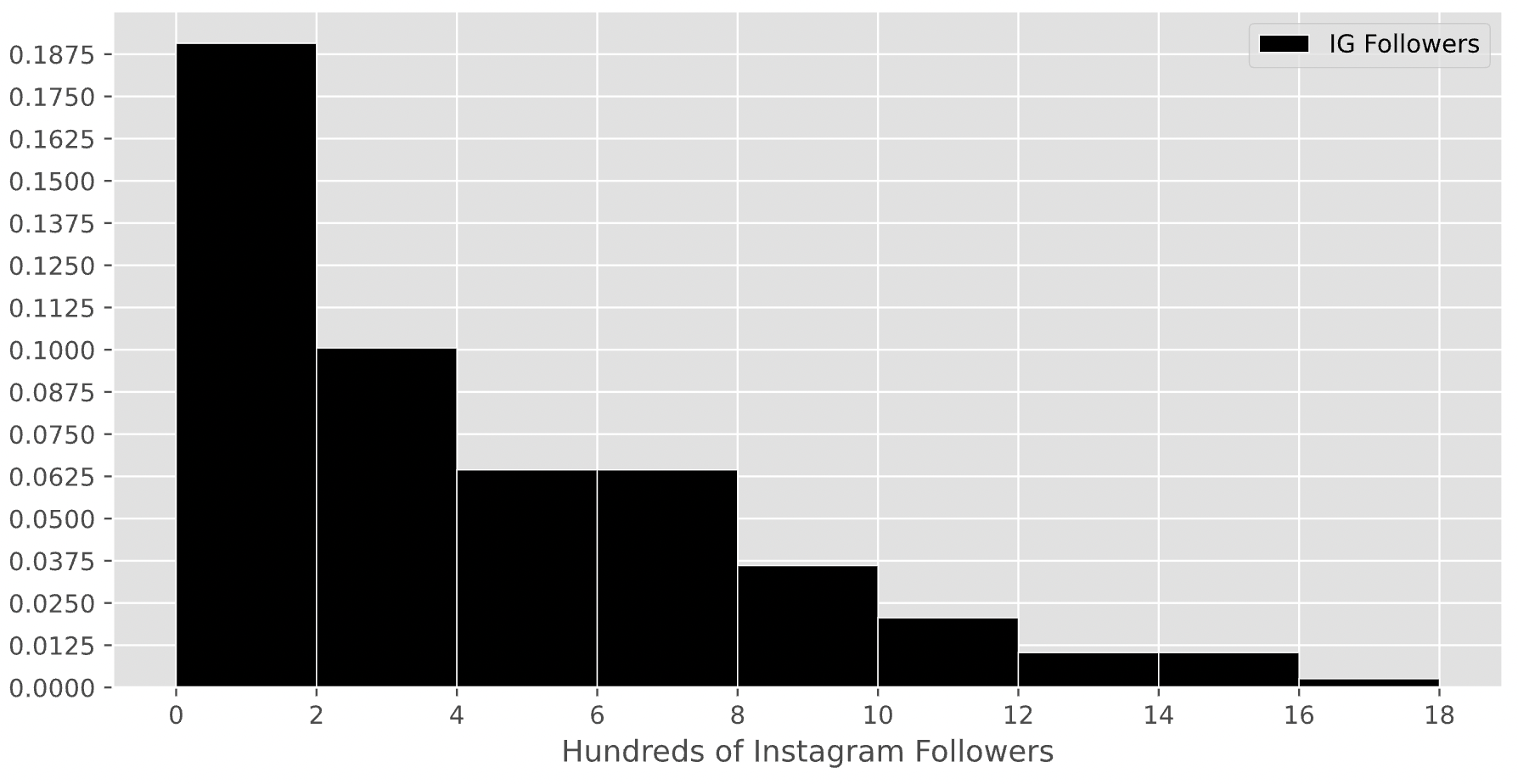
How many students in DSC 10 have between 200 and 800 Instagram followers? Give your answer as an integer.
Answer: 90
Remember, the key property of histograms is that the proportion of values in a bin is equal to the area of the corresponding bar. To find the number of values in the range 2-8 (the x-axis is measured in hundreds), we’ll need to find the proportion of values in the range 2-8 and multiply that by 200, which is the total number of students in DSC 10. To find the proportion of values in the range 2-8, we’ll need to find the areas of the 2-4, 4-6, and 6-8 bars.
Area of the 2-4 bar: \text{width} \cdot \text{height} = 2 \cdot 0.1 = 0.2
Area of the 4-6 bar: \text{width} \cdot \text{height} = 2 \cdot 0.0625 = 0.125.
Area of the 6-8 bar: \text{width} \cdot \text{height} = 2 \cdot 0.0625 = 0.125.
Then, the total proportion of values in the range 2-8 is 0.2 + 0.125 + 0.125 = 0.45, so the total number of students with between 200 and 800 Instagram followers is 0.45 \cdot 200 = 90.
The average score on this problem was 49%.
Suppose the height of a bar in the above histogram is h. How many students are represented in the corresponding bin, in terms of h?
Hint: Just as in the first subpart, you’ll need to use the assumption from the start of the problem.
20 \cdot h
100 \cdot h
200 \cdot h
400 \cdot h
800 \cdot h
Answer: 400 \cdot h
As we said at the start of the last solution, the key property of histograms is that the proportion of values in a bin is equal to the area of the corresponding bar. Then, the number of students represented by a bar is the total number of students in DSC 10 (200) multiplied by the area of the bar.
Since all bars in this histogram have a width of 2, the area of a bar in this histogram is \text{width} \cdot \text{height} = 2 \cdot h. If there are 200 students in total, then the number of students represented in a bar with height h is 200 \cdot 2 \cdot h = 400 \cdot h.
To verify our answer, we can check to see if it makes sense in the context of the previous subpart. The 2-4 bin has a height of 0.1, and 400 \cdot 0.1 = 40. The total number of students in the range 2-8 was 90, so it makes sense that 40 of them came from the 2-4 bar, since the 2-4 bar takes up about half of the area of the 2-8 range.
The average score on this problem was 36%.

The DataFrame evs consists of 32 rows,
each of which contains information about a different EV model.
"Brand" (str): The vehicle’s manufacturer."Model" (str): The vehicle’s model name."BodyStyle" (str): The vehicle’s body style."Seats" (int): The vehicle’s number of seats."TopSpeed" (int): The vehicle’s top speed, in
kilometers per hour."Range" (int): The vehicle’s range, or distance it can
travel on a single charge, in kilometers.The first few rows of evs are shown below (though
remember, evs has 32 rows total).
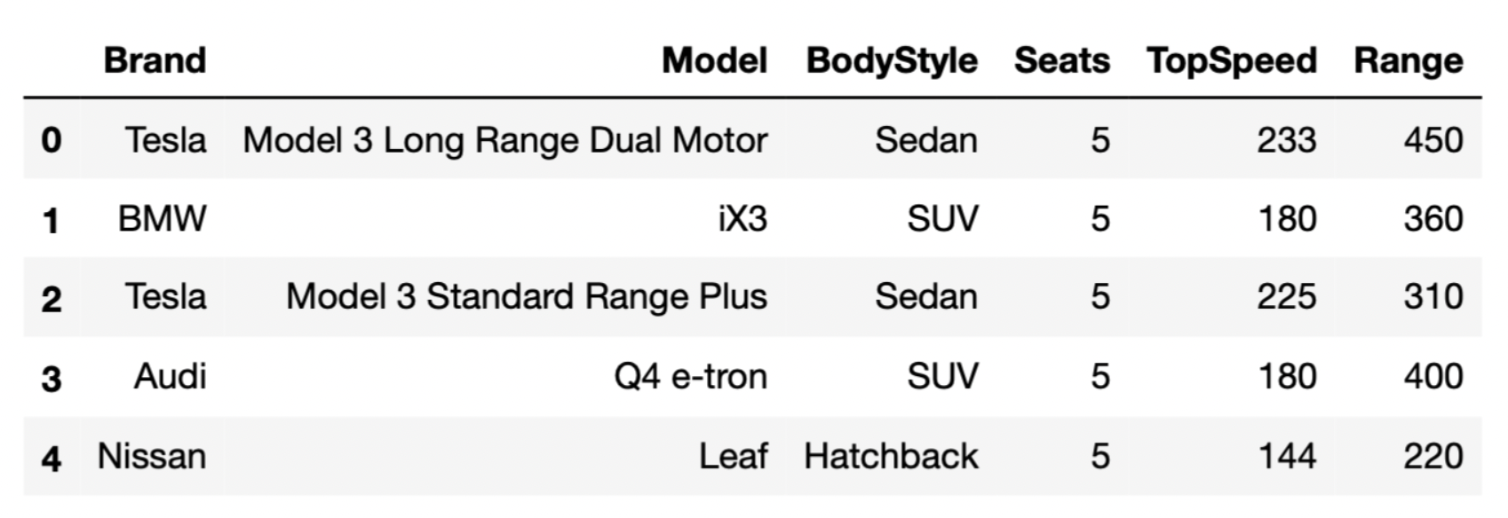
Assume that we have already run import babypandas as bpd
and import numpy as np.
Which type of visualization should we use to visualize the
distribution of "Range"?
Bar chart
Histogram
Scatter plot
Line plot
Answer: Histogram
"Range" is a numerical (i.e. quantitative) variable, and
we use histograms to visualize the distribution of numerical
variables.
"Range" is not
categorical."Range").
The average score on this problem was 63%.
Teslas, on average, tend to have higher "Range"s than
BMWs. In which of the following visualizations would we be able to see
this pattern? Select all that apply.
A bar chart that shows the distribution of "Brand"
A bar chart that shows the average "Range" for each
"Brand"
An overlaid histogram showing the distribution of
"Range" for each "Brand"
A scatter plot with "TopSpeed" on the x-axis and "Range" on the y-axis
Answer:
"Range" for each
"Brand""Range" for each "Brand"Let’s look at each option more closely.
Option 1: A bar chart showing the distribution
of "Brand" would only show us how many cars of each
"Brand" there are. It would not tell us anything about the
average "Range" of each "Brand".
Option 2: A bar chart showing the average range
for each "Brand" would help us directly visualize how the
average range of each "Brand" compares to one
another.
Option 3: An overlaid histogram, although
perhaps a bit messy, would also give us a general idea of the average
range of each "Brand" by giving us the distribution of the
"Range" of each brand. In the scenario mentioned in the
question, we’d expect to see that the Tesla distribution is further
right than the BMW distribution.
Option 4: A scatter plot of
"TopSpeed" against "Range" would only
illustrate the relationship between "TopSpeed" and
"Range", but would contain no information about the
"Brand" of each EV.
The average score on this problem was 91%.
Suppose we’ve run the following two lines of code.
first = evs.get("Brand").apply(max)
second = evs.get("Brand").max()
Note:
v is defined as
len(v), unless v is a DataFrame, in which case
its length is v.shape[0].s is a string, then max(s) also
evaluates to a string.Fill in the blanks: first is a __(i)__ of length
__(ii)__.
(i):
list
array
string
DataFrame
Series
(ii): _____
Answer:
The .apply method applies a function on every element of
a Series. Here, evs.get("Brand").apply(max) applies the
max function on every element of the "Brand"
column of evs, producing a new Series with the same length
as evs.
While not necessary to answer the question, if s is a
string, then max(s) evaluates to the single character in
s that is last in the alphabet. For instance,
max("zebra") evaluates to "z". As such,
evs.get("Brand").apply(max) is a Series of 32 elements,
each of which is a single character, corresponding to the latest
character in the alphabet for each entry in
evs.get("Brand").
The average score on this problem was 65%.
Fill in the blanks: second is a __(i)__ of length
__(ii)__.
(i):
list
array
string
DataFrame
Series
(ii): _____
Answer:
The .max() method will find the “largest” element in the
Series it is called in, which in this case is
evs.get("Brand"). The way that strings are ordered is
alphabetically, so evs.get("Brand").max() will be the last
value of "Brand" alphabetically. Since we were told that
the only values in the "Brand" column are
"Tesla", "BMW", "Audi", and
"Nissan", the “maximum” is "Tesla", which has
a length of 5.
The average score on this problem was 54%.
Which of the following best describes the input and output types of
the .apply Series method?
input: string, output: Series
input: Series, output: function
input: function, output: Series
input: function, output: function
Answer: input: function, output: Series
It helps to think of an example of how we typically use
.apply. Consider a DataFrame called books and
a function called year_to_century that converts a year to
the century it belongs to. We might use .apply as
follows:
books.assign(publication_century = books.get('publication_year').apply(year_to_century))
.apply is called a Series method because we use it on a
Series. In this case that Series is
books.get('publication_year'). .apply takes
one input, which is the name of the function we wish to apply to each
element of the Series. In the example above, that function is
year_to_century. The result is a Series containing the
centuries for each book in the books DataFrame, which we
can then assign back as a new column to the DataFrame. So
.apply therefore takes as input a function and outputs a
Series.
The average score on this problem was 98%.
In the ikea DataFrame, the first word of each string in
the 'product' column represents the product line. For
example the HEMNES line of products includes several different products,
such as beds, dressers, and bedside tables.
The code below assigns a new column to the ikea
DataFrame containing the product line associated with each product.
(ikea.assign(product_line = ikea.get('product')
.apply(extract_product_line)))What are the input and output types of the
extract_product_line function?
takes a string as input, returns a string
takes a string as input, returns a Series
takes a Series as input, returns a string
takes a Series as input, returns a Series
Answer: takes a string as input, returns a string
To use the Series method .apply, we first need a Series,
containing values of any type. We pass in the name of a function to
.apply and essentially, .apply calls the given
function on each value of the Series, producing a Series with the
resulting outputs of those function calls. In this case,
.apply(extract_product_line) is called on the Series
ikea.get('product'), which contains string values. This
means the function extract_product_line must take strings
as inputs. We’re told that the code assigns a new column to the
ikea DataFrame containing the product line associated with
each product, and we know that the product line is a string, as it’s the
first word of the product name. This means the function
extract_product_line must output a string.
The average score on this problem was 72%.
Complete the return statement in the
extract_product_line function below.
For example,
extract_product_line('HEMNES Daybed frame with 3 drawers, white, Twin')
should return 'HEMNES'.
def extract_product_line(x):
    return _________
What goes in the blank?
Answer: x.split(' ')[0]
This function should take as input a string x,
representing a product name, and return the first word of that string,
representing the product line. Since words are separated by spaces, we
want to split the string on the space character ' '.
It’s also correct to answer x.split()[0] without
specifying to split on spaces, because the default behavior of the
string .split method is to split on any whitespace, which
includes any number of spaces, tabs, newlines, etc. Since we’re only
extracting the first word, which will be separated from the rest of the
product name by a single space, it’s equivalent to split using single
spaces and using the default of any whitespace.
The average score on this problem was 84%.
Complete the implementation of the to_minutes function
below. This function takes as input a string formatted as
'x hr, y min' where x and y
represent integers, and returns the corresponding number of minutes,
as an integer (type int in Python).
For example, to_minutes('3 hr, 5 min') should return
185.
def to_minutes(time):
    first_split = time.split(' hr, ')
    second_split = first_split[1].split(' min')
    return _________
What goes in the blank?
Answer:
int(first_split[0])*60+int(second_split[0])
As the last subpart demonstrated, if we want to compare times, it
doesn’t make sense to do so when times are represented as strings. In
the to_minutes function, we convert a time string into an
integer number of minutes.
The first step is to understand the logic. Every hour contains 60
minutes, so for a time string formatted like x hr, y min'
the total number of minutes comes from multiplying the value of
x by 60 and adding y.
The second step is to understand how to extract the x
and y values from the time string using the string methods
.split. The string method .split takes as
input some separator string and breaks the string into pieces at each
instance of the separator string. It then returns a list of all those
pieces. The first line of code, therefore, creates a list called
first_split containing two elements. The first element,
accessed by first_split[0] contains the part of the time
string that comes before ' hr, '. That is,
first_split[0] evaluates to the string x.
Similarly, first_split[1] contains the part of the time
string that comes after ' hr, '. So it is formatted like
'y min'. If we split this string again using the separator
of ' min', the result will be a list whose first element is
the string 'y'. This list is saved as
second_split so second_split[0] evaluates to
the string y.
Now we have the pieces we need to compute the number of minutes,
using the idea of multiplying the value of x by 60 and
adding y. We have to be careful with data types here, as
the bolded instructions warn us that the function must return an
integer. Right now, first_split[0] evaluates to the string
x and second_split[0] evaluates to the string
y. We need to convert these strings to integers before we
can multiply and add. Once we convert using the int
function, then we can multiply the number of hours by 60 and add the
number of minutes. Therefore, the solution is
int(first_split[0])*60+int(second_split[0]).
Note that failure to convert strings to integers using the
int function would lead to very different behavior. Let’s
take the example time string of '3 hr, 5 min' as input to
our function. With the return statement as
int(first_split[0])*60+int(second_split[0]), the function
would return 185 on this input, as desired. With the return statement as
first_split[0]*60+second_split[0], the function would
return a string of length 61, looking something like this
'3333...33335'. That’s because the * and
+ symbols do have meaning for strings, they’re just
different meanings than when used with integers.
The average score on this problem was 71%.