← return to practice.dsc10.com
These problems are taken from past quizzes and exams. Work on them
on paper, since the quizzes and exams you take in this
course will also be on paper.
We encourage you to complete these
problems during discussion section. Solutions will be made available
after all discussion sections have concluded. You don’t need to submit
your answers anywhere.
Note: We do not plan to cover all of
these problems during the discussion section; the problems we don’t
cover can be used for extra practice.
In the ikea DataFrame, the first word of each string in
the 'product' column represents the product line. For
example the HEMNES line of products includes several different products,
such as beds, dressers, and bedside tables.
The code below assigns a new column to the ikea
DataFrame containing the product line associated with each product.
(ikea.assign(product_line = ikea.get('product')
.apply(extract_product_line)))What are the input and output types of the
extract_product_line function?
takes a string as input, returns a string
takes a string as input, returns a Series
takes a Series as input, returns a string
takes a Series as input, returns a Series
Answer: takes a string as input, returns a string
To use the Series method .apply, we first need a Series,
containing values of any type. We pass in the name of a function to
.apply and essentially, .apply calls the given
function on each value of the Series, producing a Series with the
resulting outputs of those function calls. In this case,
.apply(extract_product_line) is called on the Series
ikea.get('product'), which contains string values. This
means the function extract_product_line must take strings
as inputs. We’re told that the code assigns a new column to the
ikea DataFrame containing the product line associated with
each product, and we know that the product line is a string, as it’s the
first word of the product name. This means the function
extract_product_line must output a string.
The average score on this problem was 72%.
Complete the return statement in the
extract_product_line function below.
For example,
extract_product_line('HEMNES Daybed frame with 3 drawers, white, Twin')
should return 'HEMNES'.
def extract_product_line(x):
    return _________
What goes in the blank?
Answer: x.split(' ')[0]
This function should take as input a string x,
representing a product name, and return the first word of that string,
representing the product line. Since words are separated by spaces, we
want to split the string on the space character ' '.
It’s also correct to answer x.split()[0] without
specifying to split on spaces, because the default behavior of the
string .split method is to split on any whitespace, which
includes any number of spaces, tabs, newlines, etc. Since we’re only
extracting the first word, which will be separated from the rest of the
product name by a single space, it’s equivalent to split using single
spaces and using the default of any whitespace.
The average score on this problem was 84%.
Complete the implementation of the to_minutes function
below. This function takes as input a string formatted as
'x hr, y min' where x and y
represent integers, and returns the corresponding number of minutes,
as an integer (type int in Python).
For example, to_minutes('3 hr, 5 min') should return
185.
def to_minutes(time):
    first_split = time.split(' hr, ')
    second_split = first_split[1].split(' min')
    return _________
What goes in the blank?
Answer:
int(first_split[0])*60+int(second_split[0])
As the last subpart demonstrated, if we want to compare times, it
doesn’t make sense to do so when times are represented as strings. In
the to_minutes function, we convert a time string into an
integer number of minutes.
The first step is to understand the logic. Every hour contains 60
minutes, so for a time string formatted like x hr, y min'
the total number of minutes comes from multiplying the value of
x by 60 and adding y.
The second step is to understand how to extract the x
and y values from the time string using the string methods
.split. The string method .split takes as
input some separator string and breaks the string into pieces at each
instance of the separator string. It then returns a list of all those
pieces. The first line of code, therefore, creates a list called
first_split containing two elements. The first element,
accessed by first_split[0] contains the part of the time
string that comes before ' hr, '. That is,
first_split[0] evaluates to the string x.
Similarly, first_split[1] contains the part of the time
string that comes after ' hr, '. So it is formatted like
'y min'. If we split this string again using the separator
of ' min', the result will be a list whose first element is
the string 'y'. This list is saved as
second_split so second_split[0] evaluates to
the string y.
Now we have the pieces we need to compute the number of minutes,
using the idea of multiplying the value of x by 60 and
adding y. We have to be careful with data types here, as
the bolded instructions warn us that the function must return an
integer. Right now, first_split[0] evaluates to the string
x and second_split[0] evaluates to the string
y. We need to convert these strings to integers before we
can multiply and add. Once we convert using the int
function, then we can multiply the number of hours by 60 and add the
number of minutes. Therefore, the solution is
int(first_split[0])*60+int(second_split[0]).
Note that failure to convert strings to integers using the
int function would lead to very different behavior. Let’s
take the example time string of '3 hr, 5 min' as input to
our function. With the return statement as
int(first_split[0])*60+int(second_split[0]), the function
would return 185 on this input, as desired. With the return statement as
first_split[0]*60+second_split[0], the function would
return a string of length 61, looking something like this
'3333...33335'. That’s because the * and
+ symbols do have meaning for strings, they’re just
different meanings than when used with integers.
The average score on this problem was 71%.
Consider the function tom_nook, defined below. Recall
that if x is an integer, x % 2 is
0 if x is even and 1 if
x is odd.
def tom_nook(crossing):
    bells = 0
    for nook in np.arange(crossing):
        if nook % 2 == 0:
            bells = bells + 1
        else:
            bells = bells - 2
    return bells
What value does tom_nook(8) evaluate to?
-6
-4
-2
0
2
4
6
Answer: -4
The average score on this problem was 79%.
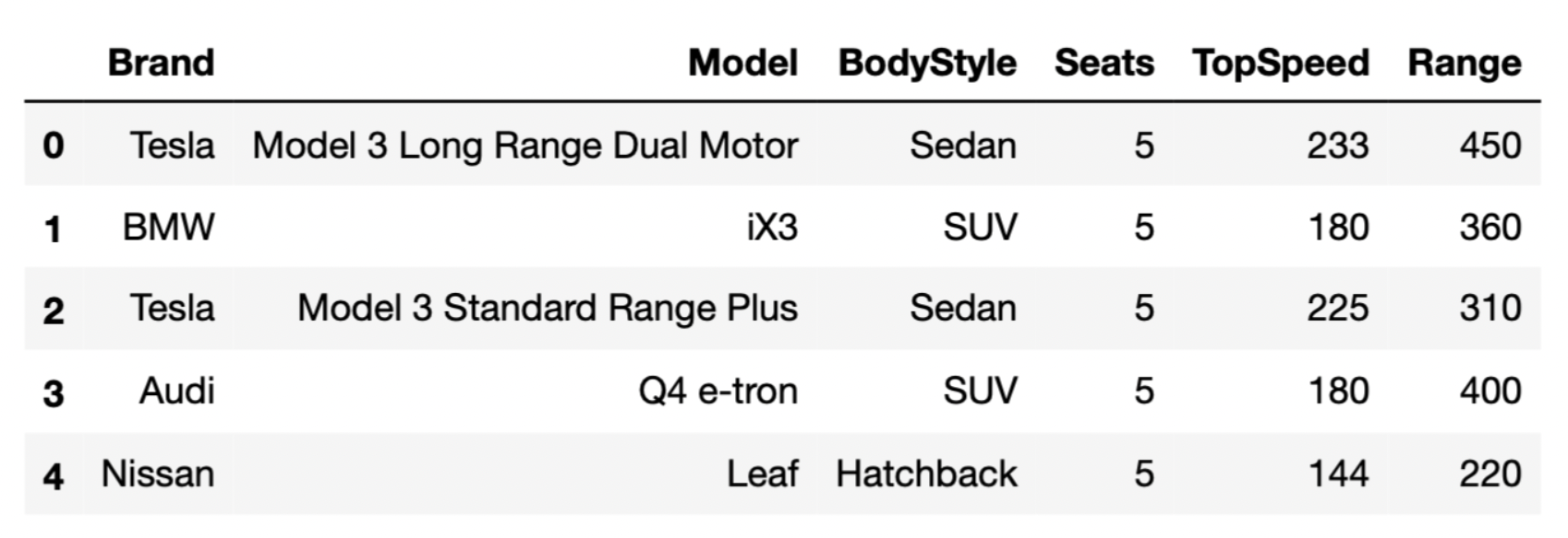
The DataFrame evs consists of 32 rows, each of which
contains information about a different EV model.
The first few rows of evs are shown below.
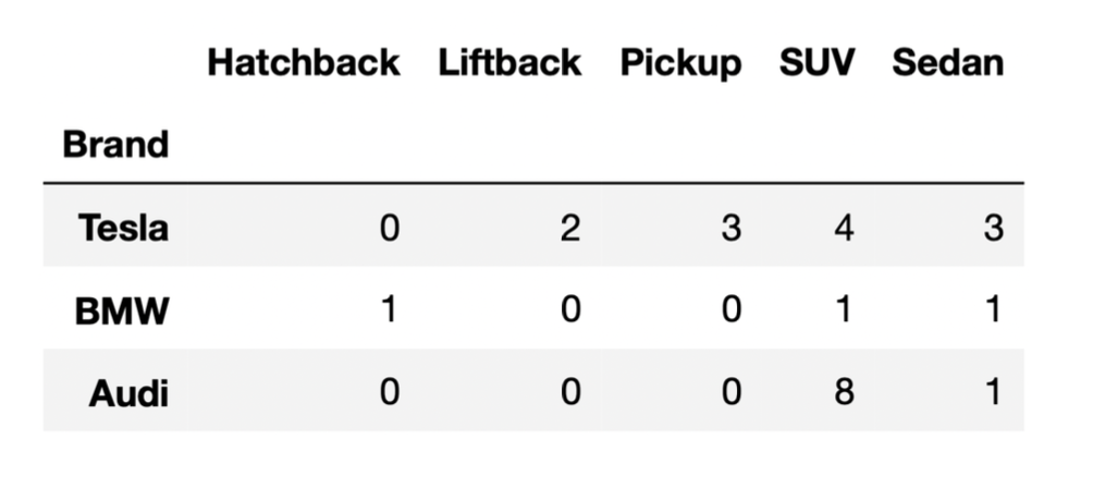
We also have a DataFrame that contains the distribution of
“BodyStyle” for all “Brands” in evs, other than Nissan.
Suppose we’ve run the following few lines of code.
tesla = evs[evs.get("Brand") == "Tesla"]
bmw = evs[evs.get("Brand") == "BMW"]
audi = evs[evs.get("Brand") == "Audi"]

combo = tesla.merge(bmw, on="BodyStyle").merge(audi, on="BodyStyle")
How many rows does the DataFrame combo have?
21
24
35
65
72
96
Answer: 35
Let’s attempt this problem step-by-step. We’ll first determine the
number of rows in tesla.merge(bmw, on="BodyStyle"), and
then determine the number of rows in combo. For the
purposes of the solution, let’s use temp to refer to the
first merged DataFrame,
tesla.merge(bmw, on="BodyStyle").
Recall, when we merge two DataFrames, the resulting
DataFrame contains a single row for every match between the two columns,
and rows in either DataFrame without a match disappear. In this problem,
the column that we’re looking for matches in is
"BodyStyle".
To determine the number of rows of temp, we need to
determine which rows of tesla have a
"BodyStyle" that matches a row in bmw. From
the DataFrame provided, we can see that the only
"BodyStyle"s in both tesla and
bmw are SUV and sedan. When we merge tesla and
bmw on "BodyStyle":
tesla each match the 1 SUV row in
bmw. This will create 4 SUV rows in temp.tesla each match the 1 sedan row in
bmw. This will create 3 sedan rows in
temp.So, temp is a DataFrame with a total of 7 rows, with 4
rows for SUVs and 3 rows for sedans (in the "BodyStyle")
column. Now, when we merge temp and audi on
"BodyStyle":
temp each match the 8 SUV rows in
audi. This will create 4 \cdot 8
= 32 SUV rows in combo.temp each match the 1 sedan row in
audi. This will create 3 \cdot 1
= 3 sedan rows in combo.Thus, the total number of rows in combo is 32 + 3 = 35.
Note: You may notice that 35 is the result of multiplying the
"SUV" and "Sedan" columns in the DataFrame
provided, and adding up the results. This problem is similar to Problem 5 from the Fall 2021
Midterm.
The average score on this problem was 45%.
The sums function takes in an array of numbers and
outputs the cumulative sum for each item in the array. The cumulative
sum for an element is the current element plus the sum of all the
previous elements in the array.
For example:
>>> sums(np.array([1, 2, 3, 4, 5]))
array([1, 3, 6, 10, 15])
>>> sums(np.array([100, 1, 1]))
array([100, 101, 102])
The incomplete definition of sums is shown below.
def sums(arr):
    res = _________
             (a)
    res = np.append(res, arr[0])
    for i in _________:
                (b)
        res = np.append(res, _________)
                                (c)
return resFill in blank (a).
Answer: np.array([]) or
[]
res is the list in which we’ll be storing each
cumulative sum. Thus we start by initializing res to an
empty array or list.
The average score on this problem was 100%.
Fill in blank (b).
Answer: range(1, len(arr)) or
np.arange(1, len(arr))
We’re trying to loop through the indices of arr and
calculate the cumulative sum corresponding to each entry. To access each
index in sequential order, we simply use range() or
np.arange(). However, notice that we have already appended
the first entry of arr to res on line 3 of the
code snippet. (Note that the first entry of arr is the same
as the first cumulative sum.) Thus the lower bound of
range() (or np.arange()) actually starts at 1,
not 0. The upper bound is still len(arr) as usual.
The average score on this problem was 64%.
Fill in blank (c).
Answer: res[i - 1] + arr[i] or
sum(arr[:i + 1])
Looking at the syntax of the problem, the blank we have to fill
essentially requires us to calculate the current cumulative sum, since
the rest of line will already append the blank to res for
us. One way to think of a cumulative sum is to add the “current”
arr element to the previous cumulative sum, since the
previous cumulative sum encapsulates all the previous elements. Because
we have access to both of those values, we can easily represent it as
res[i - 1] + arr[i]. The second answer is more a more
direct approach. Because the cumulative sum is just the sum of all the
previous elements up to the current element, we can directly compute it
with sum(arr[:i + 1])
The average score on this problem was 71%.
Teresa and Sophia are bored while waiting in line at Bistro and decide to start flipping a UCSD-themed coin, with a picture of King Triton’s face as the heads side and a picture of his mermaid-like tail as the tails side.

Teresa flips the coin 21 times and sees 13 heads and 8 tails. She
stores this information in a DataFrame named teresa that
has 21 rows and 2 columns, such that:
The "flips" column contains "Heads" 13
times and "Tails" 8 times.
The "Wolftown" column contains "Teresa"
21 times.
Then, Sophia flips the coin 11 times and sees 4 heads and 7 tails.
She stores this information in a DataFrame named sophia
that has 11 rows and 2 columns, such that:
The "flips" column contains "Heads" 4
times and "Tails" 7 times.
The "Makai" column contains "Sophia" 11
times.
How many rows are in the following DataFrame? Give your answer as an integer.
teresa.merge(sophia, on="flips")Hint: The answer is less than 200.
Answer: 108
Since we used the argument on="flips, rows from
teresa and sophia will be combined whenever
they have matching values in their "flips" columns.
For the teresa DataFrame:
"Heads" in the
"flips" column."Tails" in the
"flips" column.For the sophia DataFrame:
"Heads" in the
"flips" column."Tails" in the
"flips" column.The merged DataFrame will also only have the values
"Heads" and "Tails" in its
"flips" column. - The 13 "Heads" rows from
teresa will each pair with the 4 "Heads" rows
from sophia. This results in 13
\cdot 4 = 52 rows with "Heads" - The 8
"Tails" rows from teresa will each pair with
the 7 "Tails" rows from sophia. This results
in 8 \cdot 7 = 56 rows with
"Tails".
Then, the total number of rows in the merged DataFrame is 52 + 56 = 108.
The average score on this problem was 54%.
Let A be your answer to the previous part. Now, suppose that:
teresa contains an additional row, whose
"flips" value is "Total" and whose
"Wolftown" value is 21.
sophia contains an additional row, whose
"flips" value is "Total" and whose
"Makai" value is 11.
Suppose we again merge teresa and sophia on
the "flips" column. In terms of A, how many rows are in the new merged
DataFrame?
A
A+1
A+2
A+4
A+231
Answer: A+1
The additional row in each DataFrame has a unique
"flips" value of "Total". When we merge on the
"flips" column, this unique value will only create a single
new row in the merged DataFrame, as it pairs the "Total"
from teresa with the "Total" from
sophia. The rest of the rows are the same as in the
previous merge, and as such, they will contribute the same number of
rows, A, to the merged DataFrame. Thus,
the total number of rows in the new merged DataFrame will be A (from the original matching rows) plus 1
(from the new "Total" rows), which sums up to A+1.
The average score on this problem was 46%.
In recent years, there has been an explosion of board games that teach computer programming skills, including CoderMindz, Robot Turtles, and Code Monkey Island. Many such games were made possible by Kickstarter crowdfunding campaigns.
Suppose that in one such game, players must prove their understanding
of functions and conditional statements by answering questions about the
function wham, defined below. Like players of this game,
you’ll also need to answer questions about this function.
1 def wham(a, b):
2   if a < b:
3       return a + 2
4   if a + 2 == b:
5       print(a + 3)
6       return b + 1
7   elif a - 1 > b:
8       print(a)
9       return a + 2
10  else:
11 return a + 1What is printed when we run print(wham(6, 4))?
Answer: 6 8
When we call wham(6, 4), a gets assigned to
the number 6 and b gets assigned to the number 4. In the
function we look at the first if-statement. The
if-statement is checking if a, 6, is less than
b, 4. We know 6 is not less than 4, so we skip this section
of code. Next we see the second if-statement which checks
if a, 6, plus 2 equals b, 4. We know 6 + 2 = 8, which is not equal to 4. We then
look at the elif-statement which asks if a, 6,
minus 1 is greater than b, 4. This is True! 6 - 1 = 5 and 5 > 4. So we
print(a), which will spit out 6 and then we will
return a + 2. a + 2 is 6 + 2. This means the function
wham will print 6 and return 8.
The average score on this problem was 81%.
Give an example of a pair of integers a and
b such that wham(a, b) returns
a + 1.
Answer: Any pair of integers a,
b with a = b or with
a = b + 1
The desired output is a + 1. So we want to look at the
function wham and see which condition is necessary to get
the output a + 1. It turns out that this can be found in
the else-block, which means we need to find an
a and b that will not satisfy any of the
if or elif-statements.
If a = b, so for example a points to 4 and
b points to 4 then: a is not less than
b (4 < 4), a + 2 is not equal to
b (4 + 2 = 6 and 6 does
not equal 4), and a - 1 is not greater than b
(4 - 1= 3) and 3 is not greater than
4.
If a = b + 1 this means that a is greater
than b, so for example if b is 4 then
a is 5 (4 + 1 = 5). If we
look at the if-statements then a < b is not
true (5 is greater than 4), a + 2 == b is also not true
(5 + 2 = 7 and 7 does not equal 4), and
a - 1 > b is also not true (5
- 1 = 4 and 4 is equal not greater than 4). This means it will
trigger the else statement.
The average score on this problem was 94%.
Which of the following lines of code will never be executed, for any input?
3
6
9
11
Answer: 6
For this to happen: a + 2 == b then a must
be less than b by 2. However if a is less than
b it will trigger the first if-statement. This
means this second if-statement will never run, which means
that the return on line 6 never happens.
The average score on this problem was 79%.
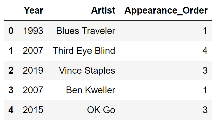
We’ll be looking at a DataFrame named sungod that
contains information on the artists who have performed at Sun God in
years past. For each year that the festival was held, we have
one row for each artist that performed that year. The columns
are:
'Year' (int): the year of the
festival'Artist' (str): the name of the
artist'Appearance_Order' (int): the order in
which the artist appeared in that year’s festival (1 means they came
onstage first)The rows of sungod are arranged in no particular
order. The first few rows of sungod are shown
below (though sungod has many more rows
than pictured here).
Assume:
'Year' of 2015 and an
'Appearance_Order' of 3).import babypandas as bpd and
import numpy as np. Fill in the blank in the code below so that
chronological is a DataFrame with the same rows as
sungod, but ordered chronologically by appearance on stage.
That is, earlier years should come before later years, and within a
single year, artists should appear in the DataFrame in the order they
appeared on stage at Sun God. Note that groupby
automatically sorts the index in ascending order.
chronological = sungod.groupby(___________).max().reset_index() ['Year', 'Artist', 'Appearance_Order']
['Year', 'Appearance_Order']
['Appearance_Order', 'Year']
None of the above.
Answer:
['Year', 'Appearance_Order']
The fact that groupby automatically sorts the index in
ascending order is important here. Since we want earlier years before
later years, we could group by 'Year', however if we
just group by year, all the artists who performed in a given
year will be aggregated together, which is not what we want. Within each
year, we want to organize the artists in ascending order of
'Appearance_Order'. In other words, we need to group by
'Year' with 'Appearance_Order' as subgroups.
Therefore, the correct way to reorder the rows of sungod as
desired is
sungod.groupby(['Year', 'Appearance_Order']).max().reset_index().
Note that we need to reset the index so that the resulting DataFrame has
'Year' and 'Appearance_Order' as columns, like
in sungod.
The average score on this problem was 85%.
Another DataFrame called music contains a row for every
music artist that has ever released a song. The columns are:
'Name' (str): the name of the music
artist'Genre' (str): the primary genre of the
artist'Top_Hit' (str): the most popular song by
that artist, based on sales, radio play, and streaming'Top_Hit_Year' (int): the year in which
the top hit song was releasedYou want to know how many musical genres have been represented at Sun
God since its inception in 1983. Which of the following expressions
produces a DataFrame called merged that could help
determine the answer?
merged = sungod.merge(music, left_on='Year', right_on='Top_Hit_Year')
merged = music.merge(sungod, left_on='Year', right_on='Top_Hit_Year')
merged = sungod.merge(music, left_on='Artist', right_on='Name')
merged = music.merge(sungod, left_on='Artist', right_on='Name')
Answer:
merged = sungod.merge(music, left_on='Artist', right_on='Name')
The question we want to answer is about Sun God music artists’
genres. In order to answer, we’ll need a DataFrame consisting of rows of
artists that have performed at Sun God since its inception in 1983. If
we merge the sungod DataFrame with the music
DataFrame based on the artist’s name, we’ll end up with a DataFrame
containing one row for each artist that has ever performed at Sun God.
Since the column containing artists’ names is called
'Artist' in sungod and 'Name' in
music, the correct syntax for this merge is
merged = sungod.merge(music, left_on='Artist', right_on='Name').
Note that we could also interchange the left DataFrame with the right
DataFrame, as swapping the roles of the two DataFrames in a merge only
changes the ordering of rows and columns in the output, not the data
itself. This can be written in code as
merged = music.merge(sungod, left_on='Name', right_on='Artist'),
but this is not one of the answer choices.
The average score on this problem was 86%.
Consider an artist that has only appeared once at Sun God. At the time of their Sun God performance, we’ll call the artist
Complete the function below so it outputs the appropriate description for any input artist who has appeared exactly once at Sun God.
def classify_artist(artist):
    filtered = merged[merged.get('Artist') == artist]
    year = filtered.get('Year').iloc[0]
    top_hit_year = filtered.get('Top_Hit_Year').iloc[0]
    if ___(a)___ > 0:
        return 'up-and-coming'
    elif ___(b)___:
        return 'outdated'
    else:
return 'trending'What goes in blank (a)?
Answer: top_hit_year - year
Before we can answer this question, we need to understand what the
first three lines of the classify_artist function are
doing. The first line creates a DataFrame with only one row,
corresponding to the particular artist that’s passed in as input to the
function. We know there is just one row because we are told that the
artist being passed in as input has appeared exactly once at Sun God.
The next two lines create two variables:
year contains the year in which the artist performed at
Sun God, andtop_hit_year contains the year in which their top hit
song was released.Now, we can fill in blank (a). Notice that the body of the
if clause is return 'up-and-coming'. Therefore
we need a condition that corresponds to up-and-coming, which we are told
means the top hit came out after the artist appeared at Sun God. Using
the variables that have been defined for us, this condition is
top_hit_year > year. However, the if
statement condition is already partially set up with > 0
included. We can simply rearrange our condition
top_hit_year > year by subtracting year
from both sides to obtain top_hit_year - year > 0, which
fits the desired format.
The average score on this problem was 89%.
What goes in blank (b)?
Answer: year-top_hit_year > 5
For this part, we need a condition that corresponds to an artist
being outdated which happens when their top hit came out more than five
years prior to their appearance at Sun God. There are several ways to
state this condition: year-top_hit_year > 5,
year > top_hit_year + 5, or any equivalent condition
would be considered correct.
The average score on this problem was 89%.
King Triton, UCSD’s mascot, is quite the traveler! For this question,
we will be working with the flights DataFrame, which
details several facts about each of the flights that King Triton has
been on over the past few years. The first few rows of
flights are shown below.
Here’s a description of the columns in flights:
'DATE': the date on which the flight occurred. Assume
that there were no “redeye” flights that spanned multiple days.'FLIGHT': the flight number. Note that this is not
unique; airlines reuse flight numbers on a daily basis.'FROM' and 'TO': the 3-letter airport code
for the departure and arrival airports, respectively. Note that it’s not
possible to have a flight from and to the same airport.'DIST': the distance of the flight, in miles.'HOURS': the length of the flight, in hours.'SEAT': the kind of seat King Triton sat in on the
flight; the only possible values are 'WINDOW',
'MIDDLE', and 'AISLE'. Suppose we create a DataFrame called socal containing
only King Triton’s flights departing from SAN, LAX, or SNA (John Wayne
Airport in Orange County). socal has 10 rows; the bar chart
below shows how many of these 10 flights departed from each airport.
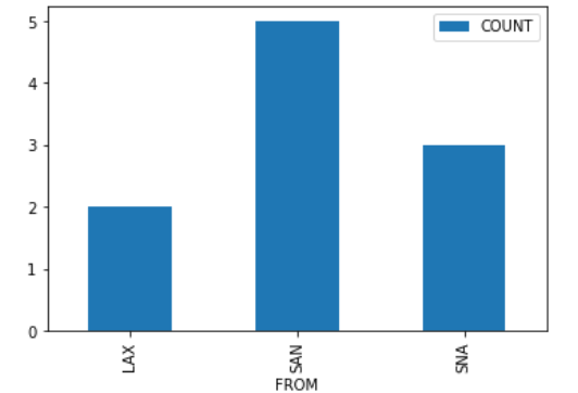
Consider the DataFrame that results from merging socal
with itself, as follows:
double_merge = socal.merge(socal, left_on='FROM', right_on='FROM')How many rows does double_merge have?
Answer: 38
There are two flights from LAX. When we merge socal with
itself on the 'FROM' column, each of these flights gets
paired up with each of these flights, for a total of four rows in the
output. That is, the first flight from LAX gets paired with both the
first and second flights from LAX. Similarly, the second flight from LAX
gets paired with both the first and second flights from LAX.
Following this logic, each of the five flights from SAN gets paired with each of the five flights from SAN, for an additional 25 rows in the output. For SNA, there will be 9 rows in the output. The total is therefore 2^2 + 5^2 + 3^2 = 4 + 25 + 9 = 38 rows.
The average score on this problem was 27%.
We define a “route” to be a departure and arrival airport pair. For
example, all flights from 'SFO' to 'SAN' make
up the “SFO to SAN route”. This is different from the “SAN to SFO
route”.
Fill in the blanks below so that
most_frequent.get('FROM').iloc[0] and
most_frequent.get('TO').iloc[0] correspond to the departure
and destination airports of the route that King Triton has spent the
most time flying on.
most_frequent = flights.groupby(__(a)__).__(b)__
most_frequent = most_frequent.reset_index().sort_values(__(c)__)What goes in blank (a)?
Answer: ['FROM', 'TO']
We want to organize flights by route. This means we need to group by
both 'FROM' and 'TO' so any flights with the
same pair of departure and arrival airports get grouped together. To
group by multiple columns, we must use a list containing all these
column names, as in flights.groupby(['FROM', 'TO']).
The average score on this problem was 72%.
What goes in blank (b)?
count()
mean()
sum()
max()
Answer: sum()
Every .groupby command needs an aggregation function!
Since we are asked to find the route that King Triton has spent the most
time flying on, we want to total the times for all flights on a given
route.
Note that .count() would tell us how many flights King
Triton has taken on each route. That’s meaningful information, but not
what we need to address the question of which route he spent the most
time flying on.
The average score on this problem was 58%.
What goes in blank (c)?
by='HOURS', ascending=True
by='HOURS', ascending=False
by='HOURS', descending=True
by='DIST', ascending=False
Answer:
by='HOURS', ascending=False
We want to know the route that King Triton spent the most time flying
on. After we group flights by route, summing flights on the same route,
the 'HOURS' column contains the total amount of time spent
on each route. We need most_frequent.get('FROM').iloc[0]
and most_frequent.get('TO').iloc[0] to correspond with the
departure and destination airports of the route that King Triton has
spent the most time flying on. To do this, we need to sort in descending
order of time, to bring the largest time to the top of the DataFrame. So
we must sort by 'HOURS' with
ascending=False.
The average score on this problem was 94%.
We define the seasons as follows:
| Season | Month |
|---|---|
| Spring | March, April, May |
| Summer | June, July, August |
| Fall | September, October, November |
| Winter | December, January, February |
We want to create a function date_to_season that takes
in a date as formatted in the 'DATE' column of
flights and returns the season corresponding to that date.
Which of the following implementations of date_to_season
works correctly? Select all that apply.
Option 1:
def date_to_season(date):
    month_as_num = int(date.split('-')[1])
    if month_as_num >= 3 and month_as_num < 6:
        return 'Spring'
    elif month_as_num >= 6 and month_as_num < 9:
        return 'Summer'
    elif month_as_num >= 9 and month_as_num < 12:
        return 'Fall'
    else:
        return 'Winter'
Option 2:
def date_to_season(date):
    month_as_num = int(date.split('-')[1])
    if month_as_num >= 3 and month_as_num < 6:
        return 'Spring'
    if month_as_num >= 6 and month_as_num < 9:
        return 'Summer'
    if month_as_num >= 9 and month_as_num < 12:
        return 'Fall'
    else:
        return 'Winter'
Option 3:
def date_to_season(date):
    month_as_num = int(date.split('-')[1])
    if month_as_num < 3:
        return 'Winter'
    elif month_as_num < 6:
        return 'Spring'
    elif month_as_num < 9:
        return 'Summer'
    elif month_as_num < 12:
        return 'Fall'
    else:
        return 'Winter'
Option 1
Option 2
Option 3
None of these implementations of date_to_season work
correctly
Answer: Option 1, Option 2, Option 3
All three options start with the same first line of code:
month_as_num = int(date.split('-')[1]). This takes the
date, originally a string formatted such as '2021-09-07',
separates it into a list of three strings such as
['2021', '09', '07'], extracts the element in position 1
(the middle position), and converts it to an int such as 9.
Now we have the month as a number we can work with more easily.
According to the definition of seasons, the months in each season are as follows:
| Season | Month | month_as_num |
|---|---|---|
| Spring | March, April, May | 3, 4, 5 |
| Summer | June, July, August | 6, 7, 8 |
| Fall | September, October, November | 9, 10, 11 |
| Winter | December, January, February | 12, 1, 2 |
Option 1 correctly assigns months to seasons by checking if the month
falls in the appropriate range for 'Spring', then
'Summer', then 'Fall'. Finally, if all of
these conditions are false, the else branch will return the
correct answer of 'Winter' when month_as_num
is 12, 1, or 2.
Option 2 is also correct, and in fact, it does the same exact thing
as Option 1 even though it uses if where Option 1 used
elif. The purpose of elif is to check a
condition only when all previous conditions are false. So if we have an
if followed by an elif, the elif
condition will only be checked when the if condition is
false. If we have two sequential if conditions, typically
the second condition will be checked regardless of the outcome of the
first condition, which means two if statements can behave
differently than an if followed by an elif. In
this case, however, since the if statements cause the
function to return and therefore stop executing, the only
way to get to a certain if condition is when all previous
if conditions are false. If any prior if
condition was true, the function would have returned already! So this
means the three if conditions in Option 2 are equivalent to
the if, elif, elif structure of
Option 1. Note that the else case in Option 1 is reached
when all prior conditions are false, whereas the else in
Option 2 is paired only with the if statement immediately
preceding it. But since we only ever get to that third if
statement when the first two if conditions are false, we
still only reach the else branch when all three
if conditions are false.
Option 3 works similarly to Option 1, except it separates the months
into more categories, first categorizing January and February as
'Winter', then checking for 'Spring',
'Summer', and 'Fall'. The only month that
winds up in the else branch is December. We can think of
Option 3 as the same as Option 1, except the Winter months have been
separated into two groups, and the group containing January and February
is extracted and checked first.
The average score on this problem was 76%.
Assuming we’ve defined date_to_season correctly in the
previous part, which of the following lines of code correctly computes
the season for each flight in flights?
date_to_season(flights.get('DATE'))
date_to_season.apply(flights).get('DATE')
flights.apply(date_to_season).get('DATE')
flights.get('DATE').apply(date_to_season)
Answer:
flights.get('DATE').apply(date_to_season)
Our function date_to_season takes as input a single date
and converts it to a season. We cannot input a whole Series of dates, as
in the first answer choice. We instead need to apply the
function to the whole Series of dates. The correct syntax to do that is
to first extract the Series of dates from the DataFrame and then use
.apply, passing in the name of the function we wish to
apply to each element of the Series. Therefore, the correct answer is
flights.get('DATE').apply(date_to_season).
The average score on this problem was 97%.